METAMERISM
Metamerism is a phenomenon that occurs when two colours appear to match under one lighting condition, but when the light changes they don´t match anymore.
MUTED COLOURS
Colours that have low chromaticness, are not bright or have been subdued, dulled or grayed.
THINGS THAT AFFECT COLOUR PERCEPTION
Observer
We all have our likes and dislikes, history that moulds our opinions. We don´t see colours the same way, there is always a personal opinion behind. Professional designers are able to put their own preferences aside and make the design according to the on going project.
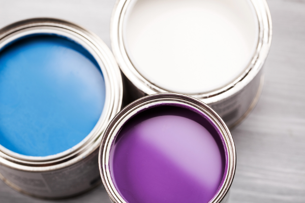
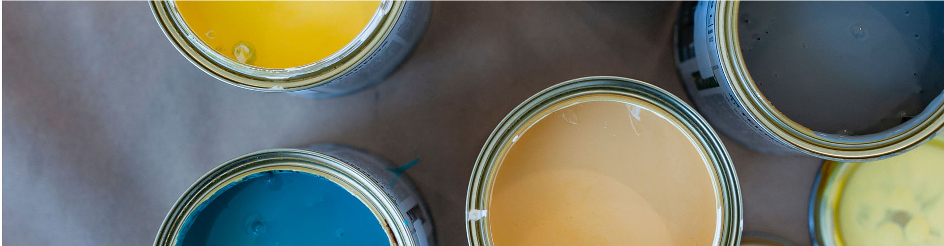
Paint gloss
Paint glosses are from full-matt to full-gloss. The glossier the painted surface the deeper and brighter the colour.
Surface structure
Colour on a more structured surface appears darker than on a smooth surface.
Lightning
Light has a huge affect on the colour. It is always important to choose the colour in its intended space. Exterior colours must be selected in natural daylight.
Distance
From a further distance there will be more light between the viewer and the object affecting the colour perception.
Environment
The colours of nearby buildings and the background (e.g. forest, lake) and all the colours (furniture, floor) of the interior have a significant affect on colour perception. Include also the already excisting colours to your colour palette to see the whole better.
COLOUR TEMPERATURES
Colour temperatures of light are measured with Kelvin, k.
The colour temperature of daylight varies according to the season and time of day. It is important to make the final decision of the Exterior colour in daylight. Daylight is cooler (5000-6000k) and for example natural grey colours seem bluish in daylight.
With artificial light it is possible to choose a desired colour temperature. For warmer colours it is preferred to use warmer (2700-3000k) light and for black and white interior, cooler (3000-4000k) light.