Teknos´ retailers
Find your local retailer or distributor from the Teknos country pages.
Your project deserves a colour that reflects your style. While personal preference comes first, surrounding buildings, local regulations, and architectural details also play a role. Teknos EXTERIOR COLOURS chart offers 122 timeless shades designed for outdoor painting—so you can discover the one that feels just right.
Painting your house is a big project, and the colour you choose will stay with you for years. Today, popular choices among homeowners include crisp whites, elegant greys, warm browns, and bold blacks. Explore our expert tips to make selecting your exterior colour easier—and enjoy a result you’ll love season after season.
1. Compare colours using real colour samples
2. Choose a shade slightly darker than your initial preference
3. Always test the colour
4. Use the actual exterior material for your test painting
5. Check the colour at different times of day and in various lighting conditions
The colours shown on our online EXTERIOR COLOURS digitally produced, and the shade you see on screen will always differ from the actual painted colour. Teknos printed colour cards feature high-quality samples that are as close to real painted colours as technically possible. Colour samples in the colour card look darker agains the white background than when painted on a larger surface. Always make your final choice using the printed colour chart and painted samples available from our retailers—combined with test painting on your own surface.
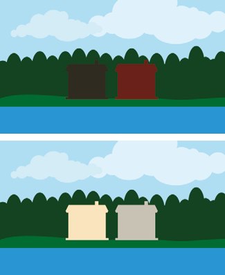
In outdoor light and on larger surfaces, colours appear slightly lighter, more saturated, and cooler compared to the sample in the colour chart. Lighter buildings stand out more from their surroundings and are visible from a greater distance than dark ones. When you choose a slightly darker and more muted shade from the Teknos exterior colour card than the one you initially want, you’ll be closer to your desired façade colour.

A painted façade looks lighter and more vibrant from a distance than a small colour chart sample viewed up close against a white background. For this reason, choose a shade that is slightly darker than your first preference.
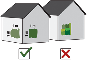
A fresh coat of paint transforms your home—so make sure the colour is exactly what you want. Paint a generous area, about one square metre, and apply a full, even coat for the most accurate result. Paint twice to also see the gloss. If you’re testing on a loose panel, view it upright. Panels placed at an angle catch more sunlight, making colours appear lighter than they really are. Taking this step helps you avoid surprises and ensures your home looks stunning for years to come.
Tip for Best Results:
Place your test paint samples far enough apart on different walls of the building. This helps you compare colour options more accurately.
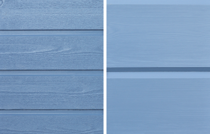
The surface texture affects how the colour appears. On rough, sawn boards, colours look slightly darker than on smooth, planed surfaces. Always use the same material for your test painting as the actual exterior surface.
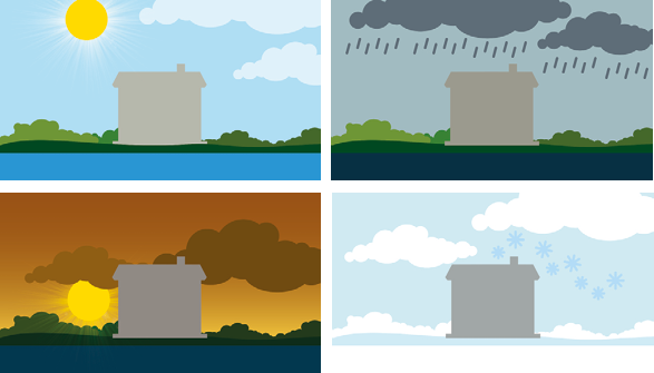
Surroundings, season, time of day, and weather all affect how colours appear. Ideally, do your test painting the summer before the actual work and review the colours in summer, autumn, winter, and spring light. If that’s not possible, observe the test area at different times of day and under varying lighting conditions.
Our colour experts have listed their favourite shades by colour to help you choose. If you already have a specific colour in mind, check these recommendations. You can also get inspired by our ready-made exterior colour palettes.
Tip: Bright yellows look even more intense outdoors. Choose softer tones for a calm façade.
Tip: Reds appear more saturated and intense on façades than on colour samples.
Tip: Greens without yellow undertones can look bluish outdoors. Choose warmer greens for a natural look
Tip: Pure whites stand out strongly—slightly tinted whites blend better with surroundings.
Tip: Brown tones shift outdoors—reddish browns look more rosy, yellowish browns more golden.
Tip: Choose a matte or semi-matte finish for a softer, more elegant look.