Matching wood with colour schemes
By guest blogger, Bordercraft
For those fond of procrastination, choosing the perfect paint colour can be a real stickler. Matching it to wood adds an additional challenge; try as many tester sticks as you like, but you may still draw a blank when it comes to selecting the right shade.
Sometimes, less is more, and sometimes you need to be brave with the bright primary colours. Applying the first few strips can be a nerve racking experience – wondering whether you’ve made the right choice as you stand back to take it all in. To give you a helping hand, we’ve looked at some classic kitchen designs and investigated what colours could work for you.
From the dark and moody to the light and airy, finding the right colour is essential to creating the atmosphere you desire, and it’s important to consider how it complements your woodwork. So, let’s see how we can make your kitchen a standout success…
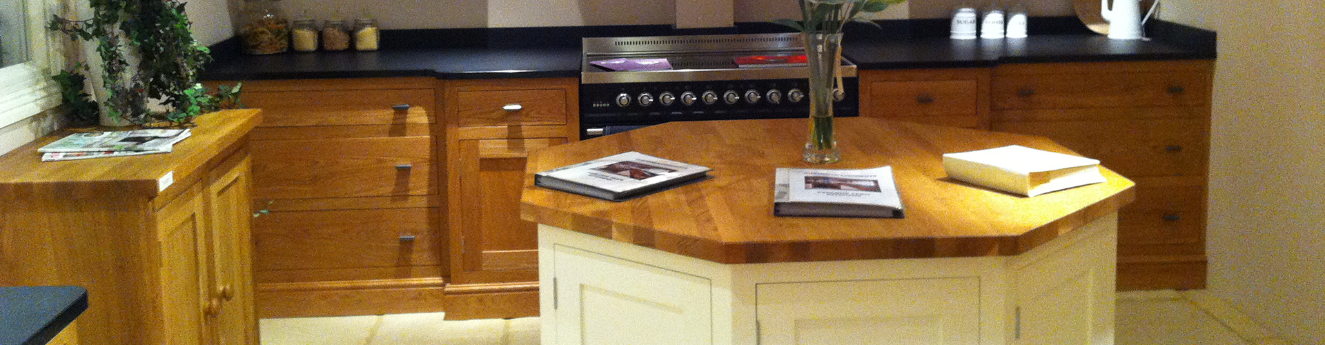
Lead with your cabinetry - the smooth contemporary look
Don’t always focus on the wall. A laid-back contemporary feel can be created with plain white walls and a little splash of colour on the wooden cabinetry. Image Courtesy of Bordercraft Workshops http://www.bordercraft.co.uk
Getting some colour into your kitchen doesn’t necessarily mean going mad on the walls! Boston-based interior designer Jean Courtney is clear with her advice, "Choose your cabinetry finish first," she says. “It's like fitting together a big puzzle, everything has to blend and flow." Laid-back style means not trying too hard and simply letting things hang together. The end result is a space where chilling with a coffee and the Sunday papers is the natural state of mind.
Seaside vibe: light and breezy
 It doesn’t have to all be about reclaimed material; a nautical vibe can be achieved with dark and light woods, and a smart use of blue.
Blue is the obvious winner when creating a watery inspired seaside kitchen. However, on top of a kitchen that gives you that holiday feel every time you make a cup of tea, you get oceans of calm and tranquillity. The blue and white look, like the more overtly stylish black and white, is a classic not to be ignored when looking for ideas. While this style works well with reclaimed wood, there’s nothing wrong with ordering bespoke pieces, too.
Rustic colour
Reclaimed wood is both good for the environment and great for style. It’s versatile in that it can be mixed with an industrial, minimal look or with a bright homely, rustic look. If you’re looking for the minimal vibe, then getting to grips with distressed walls could be a big plus.
More on how to distress your wall can be found here.
The bright side
 Happy yet? It’d be hard not to have a smile on your face while in this bright environment. Thanks to Will over at Bright Bazaar (http://www.brightbazaarblog.com/) for this one.
If considering a brighter option, our advice is “go yellow”. This might seem a brave choice, and one you may struggle to make, but for the right house and interior design theme, it can really bring a smile to your day and works well with light-coloured woodwork.
Picking the right paint can seem overwhelming at first, but if you focus on choosing the right theme and style, you’ll quickly find the right colour.
About the Author: Jon Buck has been managing director at Bordercraft since 1996. During this time he has overseen projects from a single drawer front for a local customer through to a complete Oak panelled office for a multi-national corporation in Japan. In his spare time Jon is a keen runner and loves travel and red wine in equal measures. You can connect with Bordercraft on Facebook.