How to Choose Interior Colours

Colour charts are full of beautiful shades, which can make it difficult to choose the most suitable one for your home. With the help of our colour experts' tips and colour samples, you’ll succeed in selecting the right colour and understand what to consider when comparing shades. Trust your own preferences and feel free to experiment with different colours and combinations — we promise you’ll be pleasantly surprised by how much atmosphere colours can bring to your home.

6 Steps to Finding the Right Colour

  1. Think about the atmosphere you want to create in your home.
  2. Browse our INTERIOR COLOURS colour card to find shades you like and test how they work with the existing colours in your home. Use Teknos’ paper colour samples to help.
  3. Try the colour in different lighting and at various times of day.
  4. Take into account the surface material and the paint’s sheen level, as these also affect how the colour is perceived.
  5. If needed, test paint using a mini sample can on an area about one square metre in size. Testing the colour is a great way to see how it looks in the actual space, on the intended surface, and under its lighting conditions.
  6. Remember that the paint shade changes as it dries — you’ll see the final colour once the surface has been painted twice and is completely dry 

1. THINK ABOUT THE ATMOSPHERE YOU WANT TO CREATE IN YOUR HOME

It’s easy to transform the mood of a space using different wall colours. When planning your home’s interior and colour scheme, start by considering the kind of atmosphere you’d like to achieve. Also think about the room’s purpose — do you want a calming space to unwind after a long day, or perhaps a cozy and colourful overall feel?

WARM OR COOL, LIGHT OR DARK, PURE OR MUTED?

People see and experience colours differently. In general, interior colours can be grouped into neutral, warm, and cool tones. Neutral colours include whites, greys, blacks, browns, and beiges. Warm colours include yellows, oranges, purples, and reds. Cool colours are typically blues, turquoises, and greens. However, there’s also a gradient from warm to cool within each colour group. For example, mint green tends to feel cooler than forest green.

Varin-valinta-maalisavy-Teknos.jpg Varin-valinta-maalisavy-LONDON-CALLING-Teknos.jpg Varin-valinta-maalisavy-BABY-BOX-T1608-Teknos.jpg Varin-valinta-maalisavy-JOO-JOO-Teknos.jpg

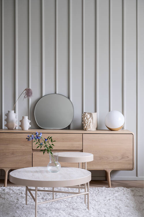
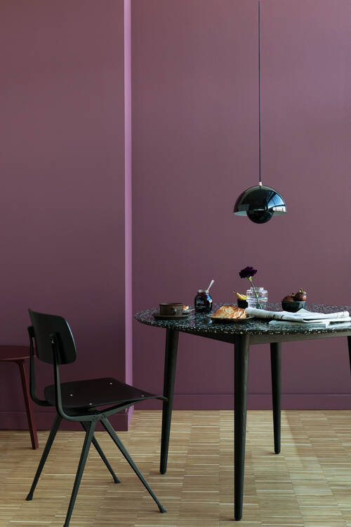
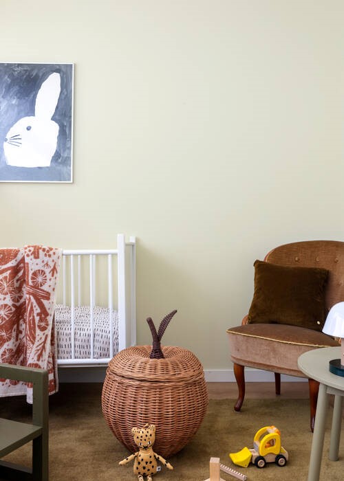
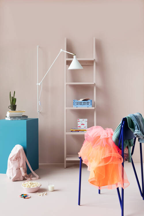
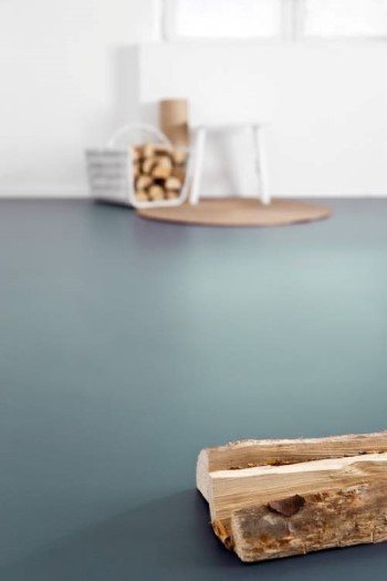
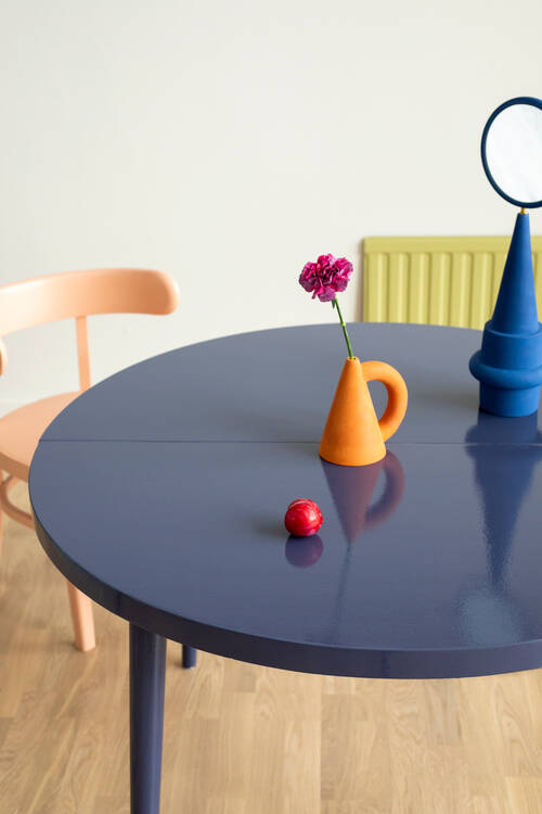
Image 1: Wall colour T7009, full-matt BIORA® BALANCE interior paint, trims painted with FUTURA® AQUA 5 furniture paint. Photographer: Pavel Kasinski | Image 2: Wall colour LONDON CALLING T1515, full-matt BIORA® BALANCE interior paint | Image 3: Wall colour BABY BOX T1608, full-matt BIORA® BALANCE interior paint | Image 4: Wall colour JOO JOO T1511, BIORA® BALANCE interior paint, shelf in JOO JOO T1511, cube in MOSCOW MUSE T1442, painted with FUTURA® AQUA 20 furniture paint.

A GOOD BASIC TIP: THINK ABOUT WHETHER YOU WANT A WARM OR COOL ATMOSPHERE, AND A DARKER OR LIGHTER OVERALL LOOK

When choosing shades, a helpful starting point is to consider whether you want the space to feel cooler or warmer, and whether you prefer a darker or lighter overall impression. Also think about how the mood changes if you choose a more muted tone instead of a purer one — it can make a surprisingly big difference.

WALL COLOUR HAS A BIG IMPACT ON THE ATMOSPHERE OF YOUR HOME

As a large surface area, wall colour significantly influences the overall feel of your home. A safe choice for wall colours is often a lighter or mid-tone muted shade. Brighter, purer tones can be confidently used in other elements of the interior.

Here are a few general guidelines to help with choosing wall colours:

  • Cool tones, very light shades, and white make a space feel more open and increase brightness.
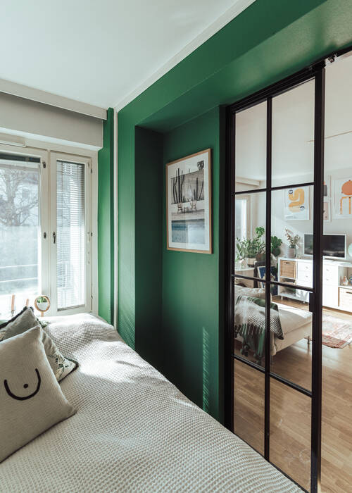
  • Earthy, muted tones create a grounded and calming atmosphere. These are often used in living areas. Explore the Nordic Phenomena colour collection for inspiration.
  • Warm wall colours help make a space feel cosier and more inviting. You’ll find these in the Cozy Weekend and Colours without Borders colours.
  • Cool, light shades are ideal for making small spaces feel larger. See the Cool Living colour collection.
  • Darker tones highlight a personal style and add a sense of intimacy and atmosphere.
  • Strong, saturated colours are experienced as energetic and dynamic. They’re best suited to spaces where relaxation isn’t the main goal, such as hallways. The Express Yourself collection includes spicy, muted tones that work well even on large surfaces.

Varin-valinta-maalisavy-vaaleansininen-T1200-Teknos.jpg

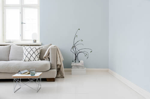
Image: Colour T1200, full-matt BIORA® BALANCE interior paint. Photographer: Sami Tirkkonen.

Tip! The colour scheme of a child’s room can be quite different from the rest of the home’s interior. If the child gets to choose the colour themselves, it’s a good idea to select a slightly lighter and more muted shade from the colour card. Children often prefer very saturated and bold colours, which can appear overly bright or harsh when used on large surfaces.

2. OBSERVE THE COLOUR IN DIFFERENT LIGHTING

Don’t rely solely on the lighting in the paint shop when evaluating a colour sample — always compare shades in the actual space and lighting where you plan to use the colour. Colours appear differently under artificial and natural light, and the amount of light significantly affects how we perceive them. In a very bright room, colours appear more vivid, while in dimmer lighting, they tend to look more subdued.

All 105 shades in our INTERIOR COLOURS colour card are available as paper samples and Mini sample cans, making it easy to test colours in your own space.

Varin-valinta-maalisavy-varimallit-varikartta-Teknos.jpg

The amount and temperature of natural light can vary significantly depending on the time of day and season. Most of the time, natural light tends to be on the cooler side. The direction from which light enters a room also affects how colours appear. For example, a shade chosen for the living room walls may look quite different in a bedroom on the opposite side of the home, simply because the light is coming from a different direction.

  • North-facing light tends to be cool and bluish. This cool natural light can make neutral greys appear bluish or make already cool tones feel even colder. To balance this effect, it’s often a good idea to choose a shade with a slight yellow undertone.
  • East-facing light is relatively neutral and doesn’t strongly alter the appearance of colours.
  • South-facing light has a warm, yellowish tone. To counteract this warmth, opt for muted blues, blue-greens, or greys, which help cool the overall feel of the space.
  • West-facing light is warm and reddish, especially in the afternoon. Muted greens and greys can help neutralise this warmth and create a more balanced look.

Varin-valinta-maalisavy-BABY-BOX-T1608-Teknos.jpg Varin-valinta-maalisavy-DUBLIN-CLOVER-Teknos.jpg

3. COMPARE WHITES WITH OTHER LIGHT SURFACES IN THE ROOM

Subtle differences between shades of white become more noticeable when compared to other light tones. When choosing a white wall colour, it’s important to compare it with other light surfaces in the space — such as the ceiling, doors, trims, and frames — to ensure the new shade complements the existing ones.

4. CONSIDER THE IMPACT OF SURFACE SIZE AND MATERIAL ON COLOUR

The material, texture, and position of the painted surface all influence how a colour appears. The larger the surface, the darker and more intense the colour tends to look. Very light shades are an exception — their subtle tones may stand out more against the white background of a colour card, but in reality, the difference may appear much less noticeable at home.

The rougher the surface, the darker the colour will seem. On a smooth surface, the colour appears lighter than it would on a textured one, such as a structured coating.

Walls and ceilings are often the most prominent continuous surfaces in a home and form the foundation for the rest of the interior colour scheme. It’s usually best to choose the wall colour first, then select complementary interior and accent colours.

Varinvalinta-maalisavy-lattia-T4018-Teknos.jpg Varinvalinta-maalisavy-lattia-ruskea-Teknos.jpg

5. CONSIDER THE EFFECT OF PAINT SHEEN ON COLOUR

When buying paint, you’ll inevitably need to choose a sheen level — so it’s worth thinking about whether you prefer a matt or glossy finish. In addition to appearance, the sheen level also affects durability: the glossier the surface, the more resistant it is to cleaning and the easier it is to maintain.

Choose the sheen based on how the room is used and your personal preferences. The glossier the finish, the deeper and more vibrant the colour appears. The same colour in a matt finish will look slightly lighter than in a gloss. You can even create large, graphic patterns using different sheen levels of the same colour. For example, in popular mountain-themed murals for children’s bedrooms, glossier snow-capped peaks layered over matt mountains add the perfect finishing touch.

Kiiltoaste-maalin-kiiltävyys-BEIJING-TEMPLE-T1547-Teknos.jpg Kiiltoaste-maalin-kiiltävyys-VILNIUS-WOLF-T1494-Teknos.jpg

  • Primers and ceiling paints, such as BIORA PRIMER, are fully matt. On ceilings, a full-matt finish helps create a calm atmosphere in the room by preventing light from reflecting off the surface.
  • Wall paints are most commonly available in full-matt, matt, and semi-matt finishes.
  • Full-matt and matt wall paints, such as BIORA BALANCE and BIORA 7, are typically used on bedroom and living room walls.
  • Semi-matt wall paints, like BIORA 20 and TIMANTTI 20, are ideal for kitchens and hallways, where walls are more likely to be exposed to splashes or dirt.

Tip! The number in the name of Teknos interior paints indicates the gloss level — the higher the number, the glossier the finish. For example: FUTURA AQUA 5 = matt, FUTURA AQUA 90 = full gloss.

6. TEST THE COLOUR

Painted surfaces always look slightly different from how colours appear on paper samples or digital screens. Paper colour samples are still a helpful starting point — they make it easy to compare and coordinate shades. To be confident in your choice, view the selected colour in the actual space and lighting where it will be used.

A test application on an area of about one square metre is a great way to see how the colour truly looks in your home. Teknos Mini sample cans cans contain just the right amount of paint for testing and are available in 105 different shades! This way, you can be sure of your choice and achieve a result you’ll enjoy living with for years to come.